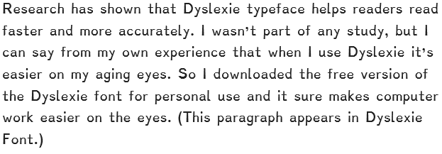
I never thought of myself as having dyslexia, but when I read an article on Dyslexie, a font created for dyslexics, I began to wonder if perhaps I had acquired it in my many years on the planet. For instance, I was once an avid reader, but now I can hardly finish a book – largely due to failing eyesight.
 The beauty of Dyslexie is that the letters are much more differentiated than standard fonts and punctuation is more pronounced, making it easier to distinguish each letter and less likely to confuse an 8 with a B, or a capital O with a zero for instance. In my years of reading serial numbers and program installation codes those were two of my nemeses.
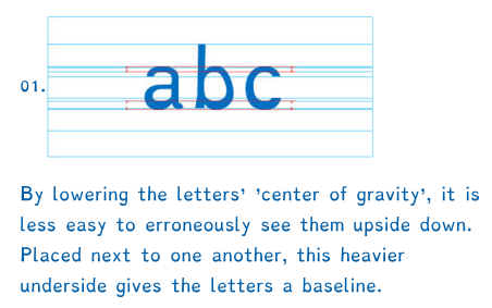
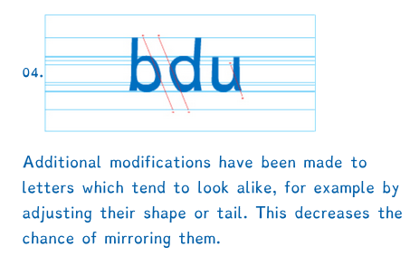 If you have dealt with dyslexia you know that dyslexics tend to see letters in mirror image or upside down. The Dyslexie typeface improves letter recognition by making parts of letters longer, or wider or slanted a little differently so that they are less easily confused. I borrowed the two examples above from DyslexieFont.com to illustrate.